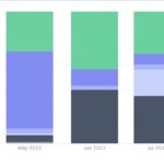
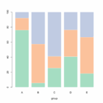
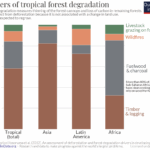
Are you confused about when to use a stacked vs clustered column chart in your data visualization? Let’s break it down in simple terms. Stacked column charts show the total value broken into segments, while clustered column charts display multiple series side by side for easy comparison.
When deciding between the two, consider your data complexity. Stacked column charts work best for illustrating parts of a whole, like market share, while clustered column charts are ideal for comparing multiple categories across different groups, such as sales by region.
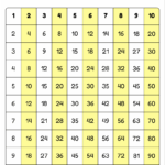
Stacked Vs Clustered Column Chart
Stacked Vs Clustered Column Chart
If you want to highlight the total and individual components in your data, a stacked column chart is the way to go. It’s great for emphasizing the overall trend while still showing the contribution of each category. On the other hand, clustered column charts are perfect for highlighting the differences between groups, making it easier to compare values at a glance.
Another factor to consider is data interpretation. Stacked column charts can sometimes be misleading if the total value is not clearly visible, leading to misinterpretations. Clustered column charts, on the other hand, provide a more straightforward comparison of values without the risk of misrepresentation.
In conclusion, the choice between a stacked vs clustered column chart depends on the story you want to tell with your data. If you need to emphasize the total and individual components, go for a stacked column chart. For comparing values across different categories, opt for a clustered column chart. Consider your data complexity and interpretation needs to make the right decision.